

 Home /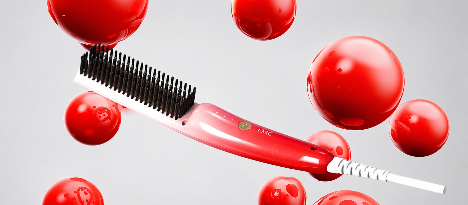
OAC Negative-Ion Hair Straightening Brush
Creating Market Differentiation Through Distinctive Product Design



Innovation Insights
Project Background
Differentiated Innovation for the Women’s Market
OAC is a new brand targeting the women’s hair styling appliance market.
As a rapidly growing product category, hair straightening brushes are gaining wider consumer recognition. The fragmented competitive landscape also created an opportunity for OAC to enter the market.
However, differentiating the product from leading brands and attracting more users became the brand’s primary objective.
Product Planning Focused on the Female User Experience
Through product testing and competitive analysis, the LKK Design team identified several key issues.
First, leading brands mainly used flat, plate-shaped comb teeth. User testing showed that these structures could easily catch and pull hair, often requiring users to push their hair manually between the teeth. This created a physically demanding and inconvenient experience.
Second, competing products placed greater emphasis on a technological appearance, leaving room to explore women’s demand for beauty and aesthetic quality in everyday products.
Third, many competing products were heavy and bulky, resulting in a less comfortable hair-brushing experience.
Design Strategy
Exterior Design
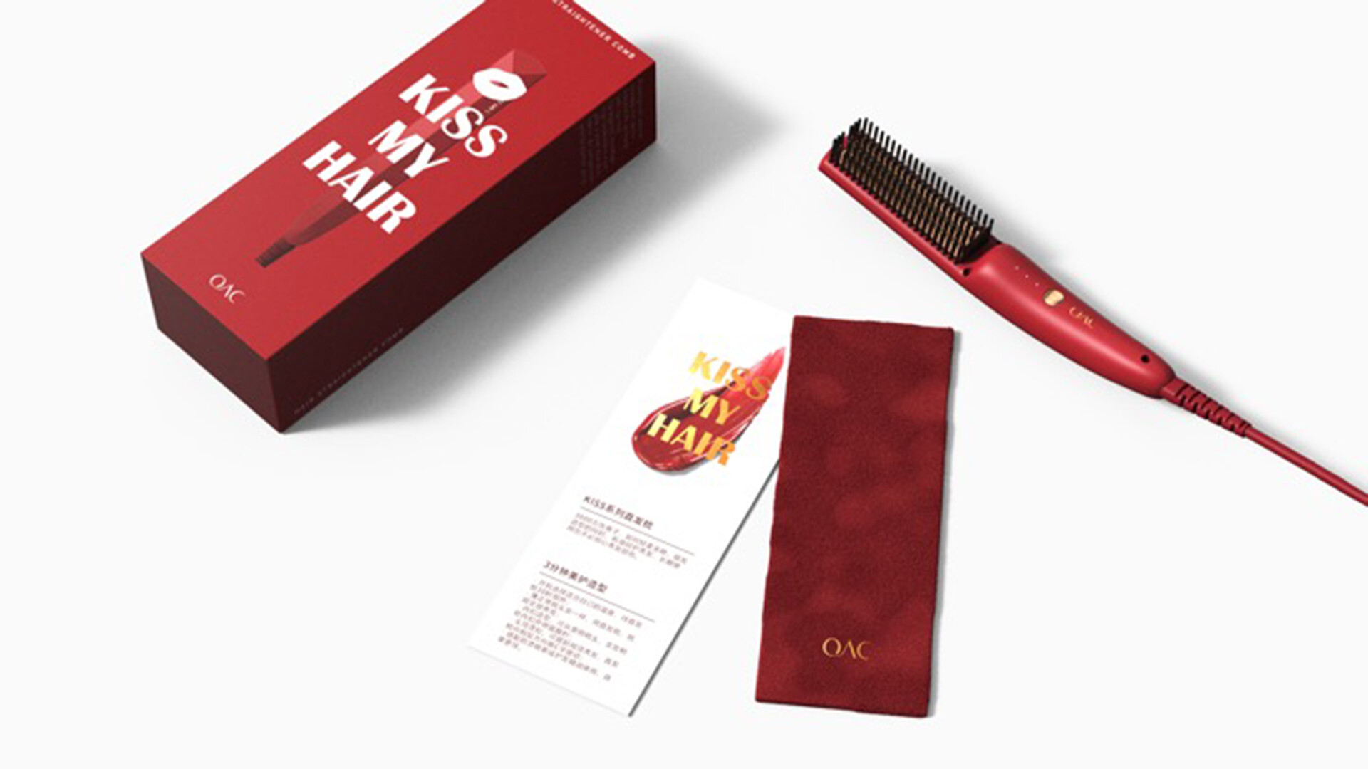
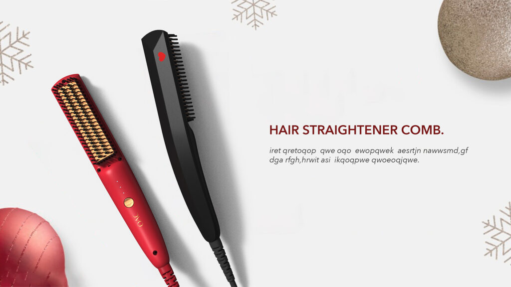
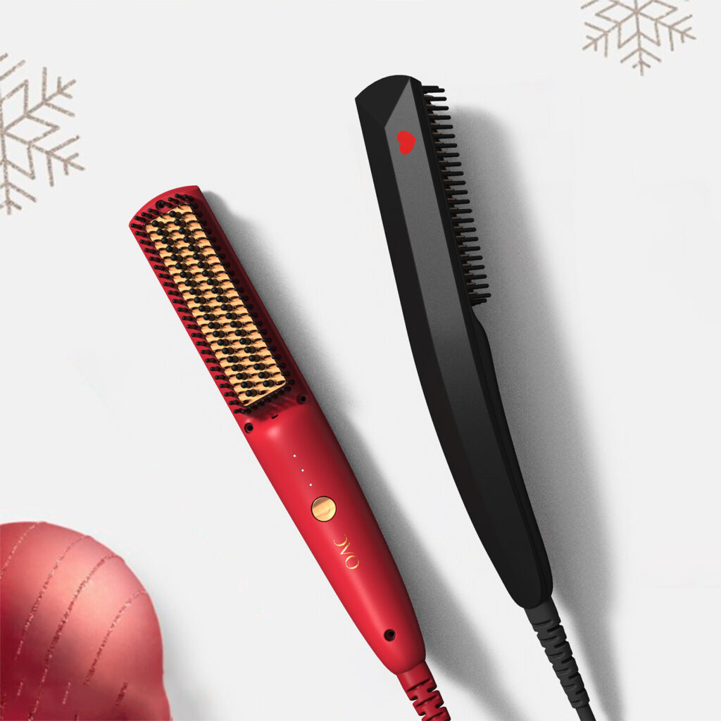
Red was selected as the primary product color because it is widely preferred by female consumers in the small household appliance market.
It also helps the product establish a distinctive identity within the hair straightening appliance category.
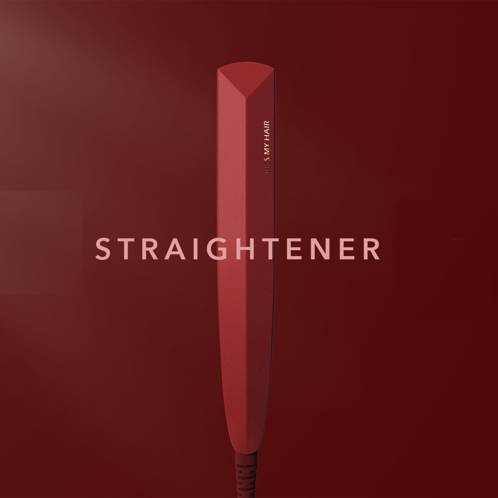
The product features prominent and expressive lines, while the handheld section is designed to be slim for a more comfortable grip.
The overall product volume was also reduced to create a lighter and more compact appearance.
Rear Product Design
The back of the product serves as its main visual display surface.
A heart-shaped graphic was incorporated into the details to express the concept of love.
It represents both the artist’s love and the care communicated by the product.
This subtle detail creates an emotional connection with female users.
Packaging Design
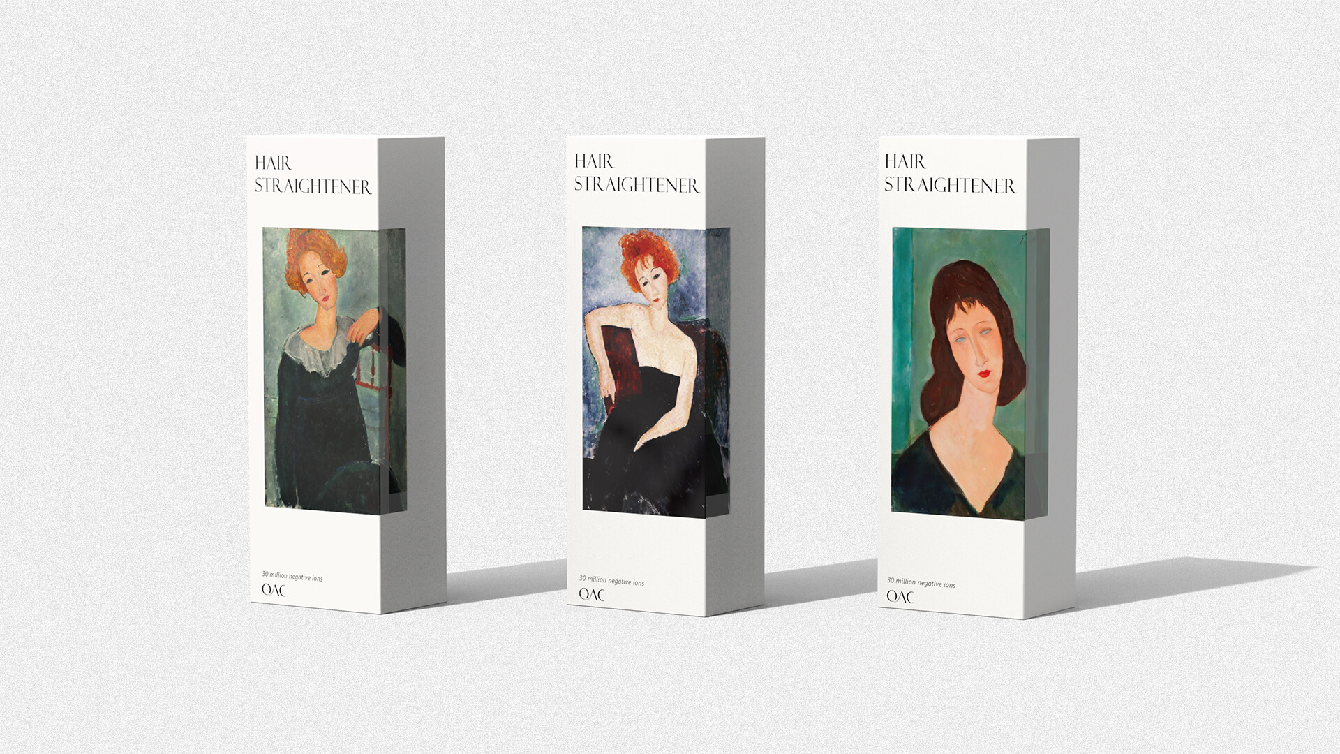
The packaging design incorporates elements from an artist’s paintings.
The artwork gives the packaging a stronger sense of art and aesthetics, helping increase the product’s perceived value.
💡 Solution
1. Slim Form and Improved Comb-Tooth Structure
The exterior was designed to provide a slim, compact, and lightweight handheld experience, making the product easier and more comfortable to use.
The conventional plate-shaped teeth were replaced with strip-shaped teeth resembling those of a traditional comb.
This structure creates a smoother brushing experience and enables convenient one-handed operation.
2. Artistic Resources and Emotional Product Value
As a new brand, the client had a limited project budget.
The design team therefore identified art resources that could be used without additional licensing costs and integrated them into the product experience.
Paintings by Modigliani were mainly selected to express the artist’s love for his wife.
The aesthetic and emotional meaning of the artwork was used to reflect the product’s negative-ion hair care concept.
Like What You See?
 Let's Talk About Your Project